

 Brian Bzdawka
What Specialized Manufacturers Need to Consider About Design and Brand
You're not Coca-Cola. I'm pretty sure you knew that already, but just in case. But, what that means is your marketing dollars need to be spent ...

Pause and think about this…
I think there is a misconception that branding is simply what your logo looks like, and maybe the colors that you use on your promotional materials and website? The fact is that now, more than ever, with nearly everyone doing their searching for products and services online, it is pretty darn important that you and everyone involved with your business understands the brand of your company.
If I was going to define brand, I would say that it is what anyone perceives when they interact with your business. So, what you look like and what you say. That includes your colors, your logo, your voice, your personality, your values, etc.
Imagine meeting someone for the first time. You walk up to them at a party and introduce yourself. Within that interaction, you make numerous judgement calls about this person based on how they look, what they say, what you perceive their beliefs and values to be, etc.
 When someone looks at your business, let’s say online (your website), they are doing that exact same thing. THAT is why branding is so important. You want that person, that potential customer, to see you as you want to be seen. If they were meeting you at a party, do you want to be wearing your torn AC/DC t-shirt and yelling at the waitstaff that you need another one of them bacon wrapped thingys? Of course not. The same way that acting like that at a party can hurt your reputation, not having a solid brand, especially conveyed on your website, can hurt your business.
Check out this awesome article from forbes.com about how Soutwest Airlines knocks their branding out of the park. It is a great example of how emotion can (and most of the time will) win over logic in terms of building a relationship with your customers.
Being a Creative Director, obviously, some of the most important things to me relate to the face of your company – your colors, logo, graphics, etc. Humans are visual and emotional creatures, so if you can connect with someone just by how your business/website looks – before they even read or hear anything from you, then you have yourself an awesome head start.
Speaking of how humans are emotional creatures, and this is just kind of a fun tangent…. when helping companies with their branding, I find myself researching the meanings behind colors. (I think it is super interesting). For example how red and yellow evoke hunger (good work McDonalds) and how blue and green evoke a sense of security, etc.
But, the looks need to go a little farther than playing on emotions and color psychology. The design of your website, each individual page, should have the same goal as the marketing and salespeople - to get someone to trust the company and take an action. (Again, when talking about the look of your brand, there is more than your website, but I am going to use that as my example... especially since we are a digital agency.) 😁
When choosing a color scheme and look of a business' website, I do take basic design/art principles into consideration, but I also think about who the website is built for. That is something that I learned here at Trending Up, working alongside marketing strategists instead of the normal scenario where I would be solely among designers. The colors, fonts and imagery of the site should be attractive, but when you consider who will be looking at them and plan accordingly then the look of your site, the design, rises above aesthetics and actually leads to ROI. Here are some things that I think about when planning the look of a website...
The colors should work well together - that includes being able to be layered on top of each other. And, it's important that you have an accent color - a color that pops out and catches the eye of the viewer. Fonts should be simple and easy to read. And, the images should be relatable to your target audience. Here are two examples to show off these ideas:
 This first example is from MiddleMarketSeller.com. Middle Market Seller is basically a company that helps CEOs sell their companies. So, the audience here is CEOs that are older in age, ready to sell their companies. They want to research and learn more about the M&A process. They are looking for help, security, trust, etc. I wanted to lean on the normal colors for financial institutions and law firms, but give it a modern look as well (not too stuffy).
So, the color scheme includes two main colors that work well together. There is a dark green and a bright green. Green is the color for money, balance, and growth. That is why many financial institutions use it. I will then choose a darker color, many times used in the footer and/or header. It also becomes the main font color. Here I lightened up the dark color and tinted it towards blue. The reason for that is cause blue is the color for trust, peace, loyalty and integrity. Make sense right? I then choose a lighter color that helps distinguish sections on a website and can also be used as a subtle background throughout. Here I went tan - also relaxing, but gives the feel of paper, libraries and ultimately resources. Lastly, and most importantly, I choose an accent color. The accent color is then used strategically throughout your design to draw the visitors eye where you want it to go. You can see in the example that we want people to download their free resource, an eBook about how to sell your company. So, the color scheme (hopefully) causes visitors to take action!
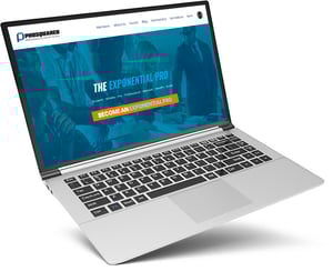 For my second example, I am going to use PROSQUAREDLLC.com. PROSQUARED is a company that helps athletes learn how to convert their incomes into permanent sustainable wealth. The audience here is student athletes, college athletes and pros. So.... athletes. For the fonts, I chose a bold, collegiate header and made it italicized to give the impression of swiftness. For the main font I chose a thin, modern looking font. I don't get too crazy when it comes to the base paragraph font. No one wants to read blocks of text in crazy fonts. Keep it simple! And for the love of all that is holy - NO SERIFS!!! (Those are the fancy feets, etc on some fonts.... Like this) Hahaha... that's just a personal preference. Feel free to use them... if you want people to feel like they are reading the glossary of your advanced sciences handbook.
In terms of images, I use PROSQUARED as an example because it pretty literally explains what I am talking about. In many cases, the images fade from images portraying professional sports and athletes into images portraying professional business settings and people. Obviously, this idea gets across the fact that PROSQUARED helps athletes make the transition from a pro on the field to a pro off the field.
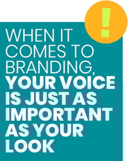 But, even though I think having a kick-ass color scheme and a sweet logo are some of the most crucial things, I can’t stress enough that your voice is just as important as your look. Looks alone aren't enough. When even the most handsome guy or prettiest gal in the room makes an inappropriate joke, snide comment or talks like a dummy - you probably don't want to spend a ton of time with them.
One of the ways that you accomplish all of that is by having a clear and cohesive marketing strategy that utilizes educational content.
Once you have a good understanding of what you want your brand to, make sure that everyone and everything that is the face or voice of your business is adhering to those brand guidelines. When everyone is on the same page – the salesperson calling customers, the voicemail message, the colors on your website, the look of your business cards, the packaging on your delivered products, the attitude of your service team, etc.- then you are allowing your brand to become the experience that your customers get when dealing with your business.

You're not Coca-Cola. I'm pretty sure you knew that already, but just in case. But, what that means is your marketing dollars need to be spent ...

There’s a ton of reasons to swing into the drive-thru and grab yourself a quick bite of a seasonal McRib sandwich. You’re thinking about the "right...

With the rise (and domination) of social media, your website has not lost importance, it has gained it. Manufacturing CEO’s, the goal of your social...